
Years ago I had worked for an e-commerce brand at a large CPG company. This was in the early 2000’s and at a time when the majority of website traffic was desktop. Everything was designed to fit a relatively large display. We watched our analytics over time show an increasing share of traffic shift to mobile. We called the “jaws of death” - the point at which mobile traffic overtook desktop. This ominous term was used to convince the power-that-be to put resources towards a redesign. A redesign that would support visitors of all display types; desktop, tablet, and mobile.
Fast forward to 2023 and every single website I build is built with a mobile first mindset. This is not a ground breaking thought process. Responsive web design has been around for a long time, gaining traction after being coined around 2010 by Ethan Marcotte.
Not all clients understand the value of having their website be “responsive”. For many, it’s challenging to break out of the “they’ll just need to look at it on a large display, like me” mindset. But the data tells the true story.
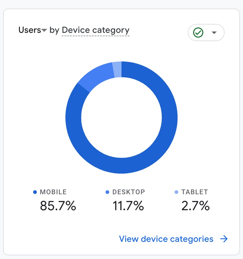
Google analytics is a ridiculously powerful insights tool. Yes, they farm your data and use it for their gain. If we agree to those terms the doors open to a data explosion. One of the most compelling points is Users By Device where we can learn what device types are visiting your site.
One such example for a website I completed in late 2023 had a staggering adoption to mobile devices!
Living in a Multi-Display World
Even if you (or your client) views a website on just a single device does not mean you should not build for other devices. Use any available data you have (analytics, marketing strategy, etc.) to build a user friendly experience to all visitors.